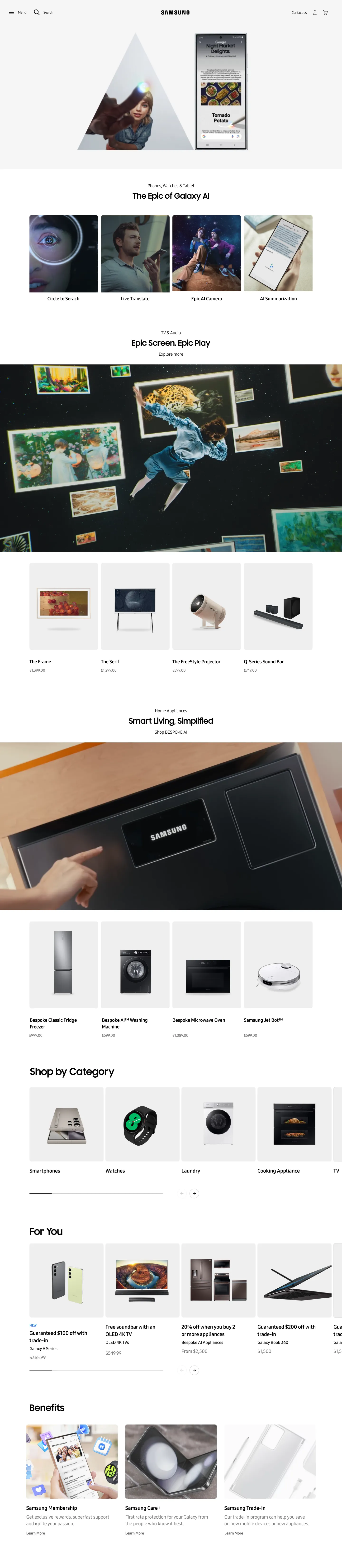
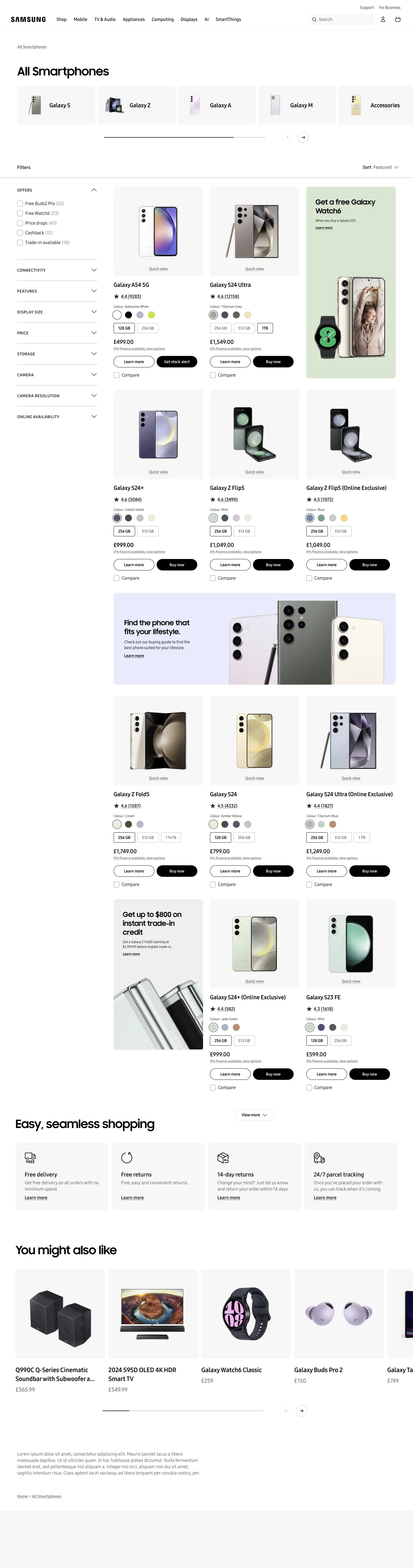
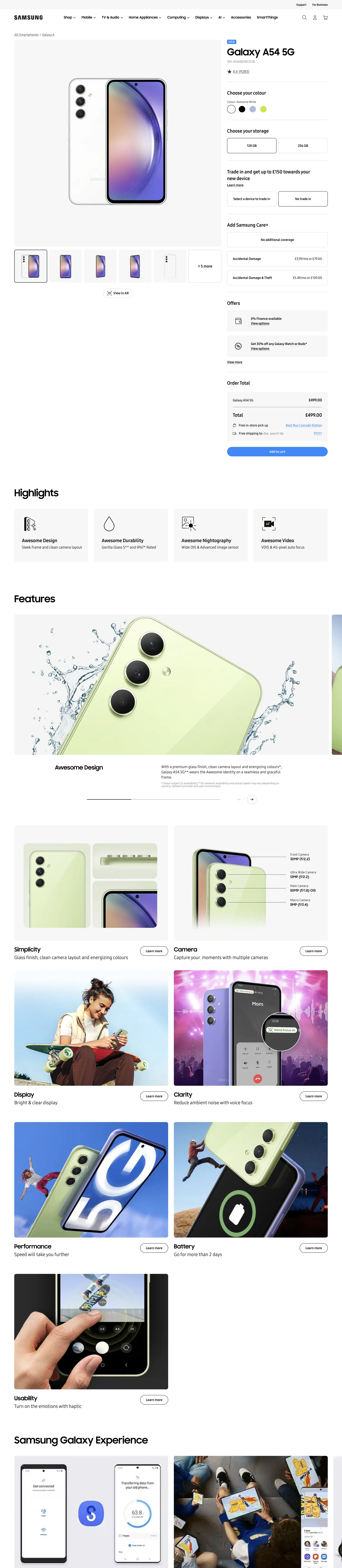
Instrument, the design agency flown in from Portland, spent two weeks in Korea without landing on a homepage direction. Each business division competed for prominence. Meetings produced opinions, not decisions.
Industry.
70+
Markets rolled out
+32%
Add-to-cart rate
−51%
Page length reduction
I joined EY as a PMO, handling competitive benchmarking, user research synthesis, and executive-level strategy decks for Samsung leadership. Once the project kicked off and the design strategy phase began, I flew to Portland for a design sprint and ended up managing the agency relationship end-to-end. My UX background kept exceeding the boundaries of the role I was hired for.
Samsung.com Global UX Revamp
Home, GNB, Search, Product Finder, Product Detail: a full redesign of Samsung's consumer-facing global platform. 70+ markets. One design system. Every business division fighting for the homepage.
Role: PMO Lead → Design Lead (scope expanded)
Consulting: Competitive benchmarking (Apple, Nike), user research insights (UK/US/KR), As-Is analysis, strategy recommendations to Samsung SVP
Owned: PF/PD pages, Homepage design direction, Agency management (Instrument, Portland)
With: Samsung HQ, Cheil (design/FRD), PTKorea (production), Samsung SDS (back-end), QA
Consulting: Competitive benchmarking (Apple, Nike), user research insights (UK/US/KR), As-Is analysis, strategy recommendations to Samsung SVP
Owned: PF/PD pages, Homepage design direction, Agency management (Instrument, Portland)
With: Samsung HQ, Cheil (design/FRD), PTKorea (production), Samsung SDS (back-end), QA
01
Pre-project Research
Competitive analysis, user journey mapping, stakeholder interviews across divisions
02
The Deadlock
Instrument Agency spent 2 weeks in Korea. Business divisions competed. No homepage direction.
03
The Override
Designed homepage with EY partner, outside scope. Presented to SVP. VP approved.
04
Portland Sprint
1 week at Instrument HQ. Design sprint. Finalized direction together.
05
Global Rollout
CGD for divisions + locals. Specs. Dev coordination. QA. 70+ markets live.
Home
PF
PD
Samsung.com global: Home (Hero → MX → VD → DA by division priority), Product Finder, Product Detail. Layout origin still used today.
The Override
My EY partner and I designed a homepage independently, outside scope, outside role. We presented it to Samsung's SVP. The VP above approved it.
The Problem
The Turn
My EY partner and I designed a homepage independently, outside scope, outside role. We presented it to Samsung's SVP. The VP above approved it. I flew to Portland for a one-week design sprint at Instrument's HQ, where we finalized the direction together. When I returned, I managed the agency relationship, its reviews and strategic alignment, until they exited.
After the Agency
Built the Content Gathering Deck for every business division and local market. Wrote design specifications. Coordinated front-end (Cheil), back-end (Samsung SDS), publication, and QA through to global rollout across 70+ markets.
+32%
Add-to-Cart rate
Simplified GNB → reduced purchase friction
+9%
PD engagement
70+
Markets
5
Page types
Samsung Semiconductor
Homepage redesign, Adobe component library, event pages, and a multi-region Foundry Forum app. B2B semiconductor, a different domain and different user with the same expectation: I was the only person on the EY team who could open a design tool.
Role: PMO + Solo Designer (only design-capable person on team)
Method: Upper-level design → handoff to domestic agency for variations
Scope: Homepage, Adobe component registration, IAA Mobility event page, SAFE/SFF event pages, JP/EMEA Foundry Forum app
Note: Homepage design still in use today
Method: Upper-level design → handoff to domestic agency for variations
Scope: Homepage, Adobe component registration, IAA Mobility event page, SAFE/SFF event pages, JP/EMEA Foundry Forum app
Note: Homepage design still in use today
Homepage
The homepage redesign shifted from a product-catalog layout to a narrative-driven entry point for enterprise buyers. I created the upper-level designs (layout, hierarchy, interaction model) and handed them to the domestic agency for production variations.
Before (2023)

My Design (2023)
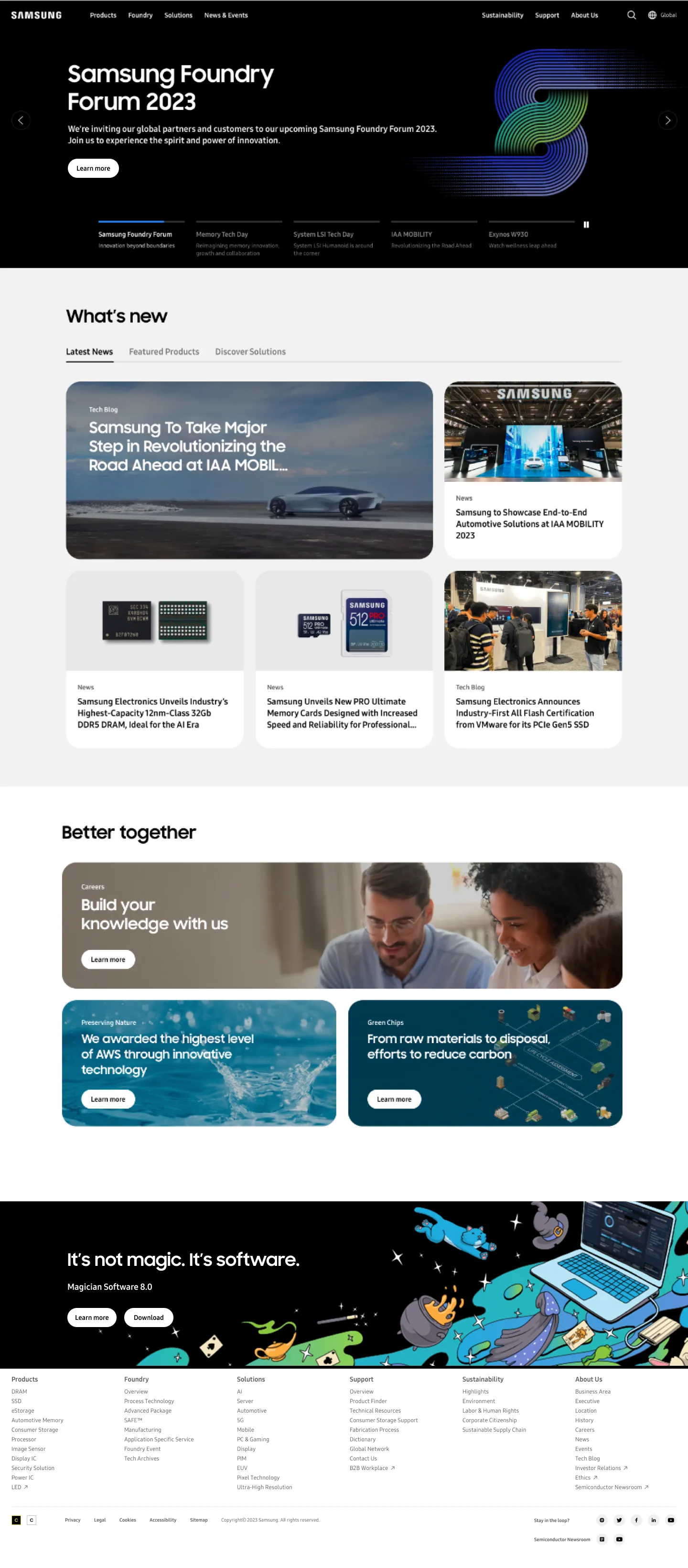
Live (2026)
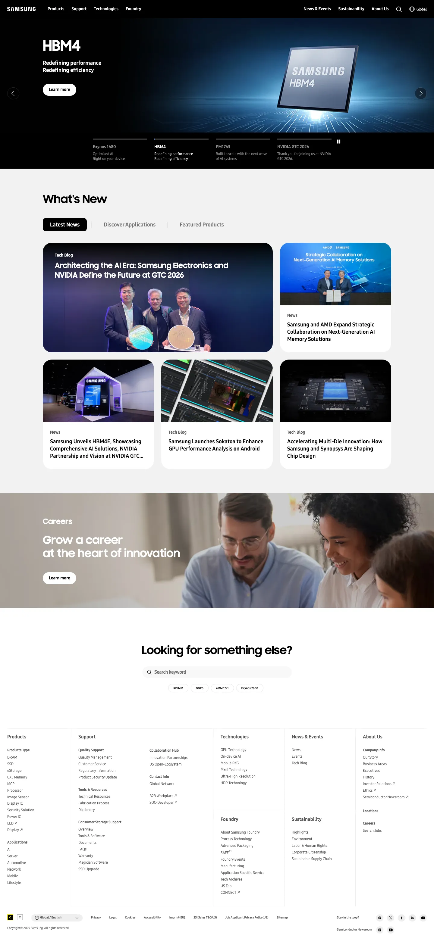
semiconductor.samsung.com: Before → My redesign → Still live today. Page length reduced by 51%.
−51%
Page length
Narrative-first IA → unnecessary depth removed
+2.2%p
CTR increase
+32s
Dwell time
25%
What's New reach
Additional Scope
View live — semiconductor.samsung.com ↗
Adobe component registration (Foundry Map, IAA Mobility module), SAFE/SFF event pages, JP/EMEA Foundry Forum app design.
AIxUX — Gen AI Visual System for Samsung Marketing
How do you deploy AI-generated imagery at brand scale without losing consistency, cultural sensitivity, or trust? We designed the system that answers that.
Role: Lead Researcher + System Designer
Output: AI UX Writing System (Principles, Requirements, Do's/Don'ts) + AI Image Generation Pipeline
Method: Multi-model comparison (ChatGPT, Perplexity, Gemini) → synthesis → Samsung-specific guidelines
Purpose: Internal research for future client proposals
Output: AI UX Writing System (Principles, Requirements, Do's/Don'ts) + AI Image Generation Pipeline
Method: Multi-model comparison (ChatGPT, Perplexity, Gemini) → synthesis → Samsung-specific guidelines
Purpose: Internal research for future client proposals
AI UX Writing
To build writing guidelines for AI-generated Samsung marketing copy, I ran the same brief through three models (ChatGPT, Perplexity, and Gemini) and compared outputs. Each model produced different principle frameworks. The differences were the research. I synthesized them into a unified system: 5 Guiding Principles, 12 pages of requirements, and a Do's/Don'ts reference for production teams.
ChatGPT
Confident & Human-centric
Aspirational but Grounded
Concise & Energetic
Accurate Product Naming
Simple & Actionable CTAs
Perplexity
User-centered & Empathetic
Clarity & Simplicity
Honesty & Transparency
Inclusivity & Neutrality
Consistency & Tone
Gemini
Be an Empowering Ally
Be Concise
Use Plain Language
Put Users First & Be Inclusive
01
Principles
3-model comparison → synthesized guidelines
→
02
Requirements
12-page spec + Do's/Don'ts reference
→
03
Prompt Design
Modular prompt guide: copywriting, translation, principles, with I/O examples
→
04
Cross-model Eval
Models score each other's output. Weighted criteria. 2 rounds.
→
05
Benchmark
Apple vs Samsung: 3 models all scored Apple higher. Why? Analyzed per-copy.
AI Image Generation
The second deliverable: a multi-model pipeline for AI-generated marketing imagery at brand scale. Cultural and language intelligence feeds into visual generators (DALL-E, Midjourney), filtered through brand QA at local and HQ levels. The key design decision was human-in-the-loop review, where AI generates and humans gate.
INPUT
Cultural Data
Local region data, cultural/visual guidelines, One UI
→
AI LAYER
Multi-model Pipeline
Language & Culture Intelligence + Visual Generator (DALL-E, Midjourney) + UX Writing
→
GATE
Human-in-the-Loop
Local QA + Brand QA (HQ) approval chain
→
OUTPUT
Launch & Monitor
Consumer KPI, UAT, data feedback → iterative improvement
As-Is · Studio Production
Months of planning. Professional studio shoots. Tens of thousands in production cost per product page.
To-Be · AI Generated
Comparable visual quality. Fraction of the cost. Days instead of months. The question shifted from "can AI match studio quality" to "how do you control it at brand scale."
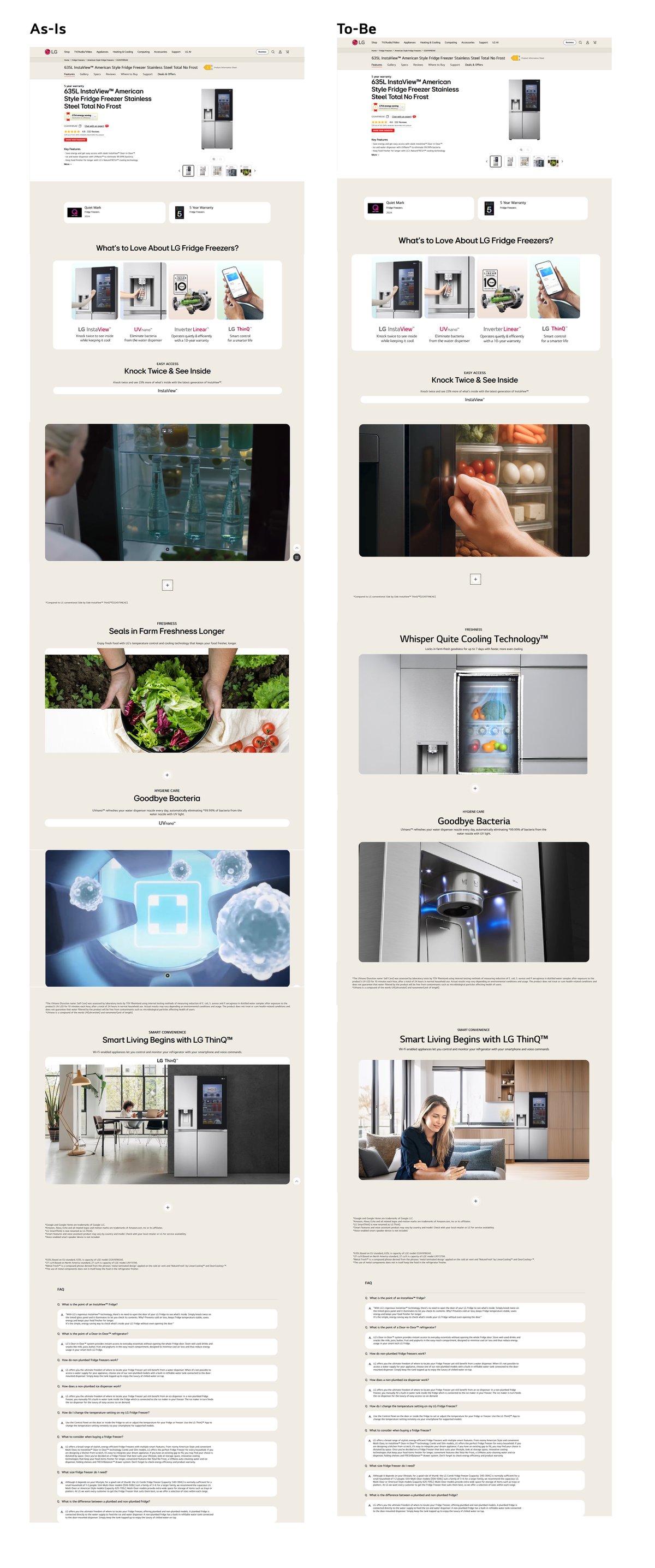
Image Guiding Principles
Five principles governed every generated image, each mapping to specific visual constraints for Samsung's global marketing pages.
01
Brand Consistency with Cultural Adaptation
Global identity + local cultural sensitivity balanced
02
Simplicity & Clarity
Unnecessary visual complexity removed. Clear, bright hierarchy
03
Product-Centric Storytelling
Product features as visual narrative, integrated with One UI
04
Inclusive & Positive Emotion
Diverse representation regardless of age, gender, race, ability
05
Human-Centered Innovation
Technology improving lives: hopeful, not dystopian
User Testing
Cross-industry homepage analysis across countries, age groups, and gender personas, testing whether AI-generated marketing imagery could meet the same trust thresholds as human-produced content across cultural contexts.
MX CRM Loyalist Newsletter
A monthly internal newsletter for Samsung's global subsidiary marketing managers. The client was furious. I had one week.
Role: Solo Designer, full ownership, emergency deployment
Sections: Yearly Recap · KPI · Loyalist Driver · Insight · Dashboard Tips · Data Export Guide · Appendix
Context: Pulled from another project. Samsung client CC'd VP and SVP in complaint email.
Sections: Yearly Recap · KPI · Loyalist Driver · Insight · Dashboard Tips · Data Export Guide · Appendix
Context: Pulled from another project. Samsung client CC'd VP and SVP in complaint email.
The Situation
The Samsung client sent an email, CC'd to the VP and SVP, saying the existing newsletter "wasn't a newsletter, it was a slide deck." The MX CRM team called my department and pulled me off another project the same day.
Before
- Presentation logic (slide deck format)
- Data-heavy, no hierarchy
- No scannable sections
- No self-service guides
- Client complaint to VP/SVP
→
After · 1 week
- Reading logic (newsletter)
- KPIs up front, insights contextual
- 8 scannable sections
- Dashboard + data export self-service
- Format became monthly standard
The Fix
I restructured the information architecture from presentation logic to reading logic, into sections a busy regional marketing manager could scan in five minutes and deep-dive when needed. The format I created became the standard the team continued producing monthly.
Three Direction Proposals: 1. CRM Email 2. Newspaper 3. Dashboard
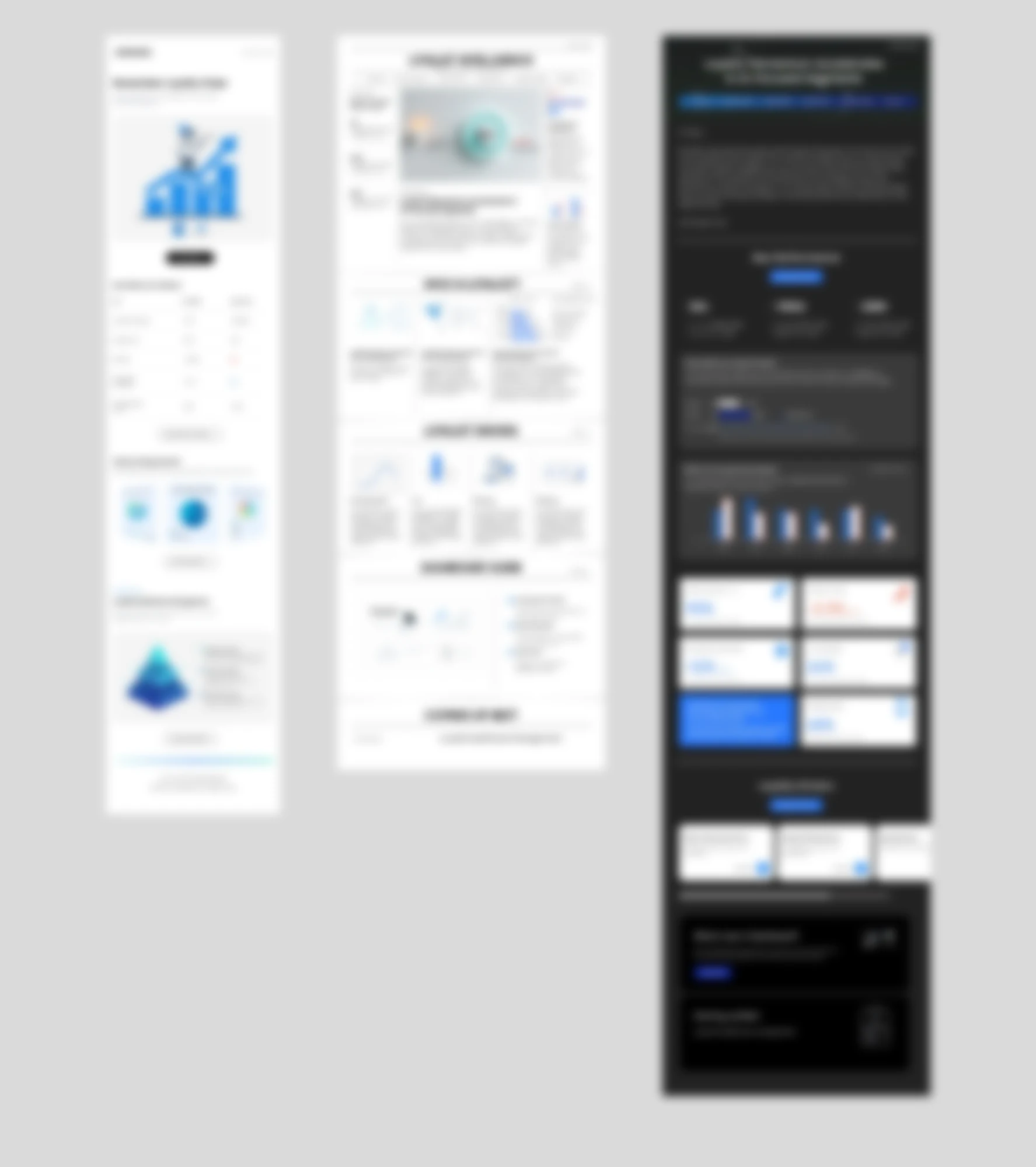
Visuals blurred under NDA, layout structure and direction proposals shown.
Version 1 → 5 · Iteration
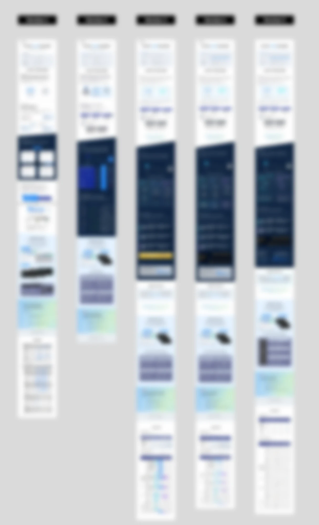
One week. Five versions. Visuals blurred under NDA.
Structure Shift
Before
Slide deck logic
— Topic-first
— Dense blocks
— Presenter-driven
→
— Topic-first
— Dense blocks
— Presenter-driven
After
Newsletter logic
— Reader-first
— Scannable hierarchy
— Self-navigating
— Reader-first
— Scannable hierarchy
— Self-navigating
Presentation logic → Reading logic. IA restructured, not reskinned.
Visuals under NDA, structure diagram shown instead
Note
The industry work taught me how design decisions scale across 70+ markets. The research taught me what those decisions do to the person making them.
↳ Both inform The Ben Study and what I'm building now. VIEW RESEARCH →